The brief was to produce the front cover, contents page and double page spread of a new music magazine containing at least four original images. The work we produced then had to be published onto a blog. Before we created our music magazine we were given a primarily task. The task was to create the front cover and a mock up of a contents page of a new school or college magazine. This work also had to be published onto our blog.
Before we made our school or college magazine we had to do some research. This research enabled me to find the contentions of a magazine. I found these out by analysing different magazine front covers. I then researched different genres of of magazines such as gossip, sport, fashion, game and school. I also looked at how they are portrayed; this included looking at target audience. Once I had done all of my research I could then make my magazine. This research helped me with the research I then had to do before I had to make my music magazine. This research consisted of analysing three music magazine front covers, three contents pages and three double page spreads. From analysing these I found the contents of a magazine front cover, contents page and double page spread. The conventions that I found out from research for magazine front covers are: masthead, date, price, main image, cover lines, left third, barcode and sell lines. The contentions that I found out from research for contents pages are: masthead, article names, headings, page reference numbers and images. The contentions I found out from research for double page spread are: masthead, article, images, pull quotes and page numbers. Once I had found out all of these contentions I then used them to help me create my own music magazine. I have used the majority of the contentions that I found.
Once I had done all of the research I then began to plan. I started of by coming up with a list of names I was thinking about calling my magazine. Out of a list of nine I narrowed it down to “verdict”. I then created computer drafts of my front cover, contents page and double page spread on Publisher. Once I had decided on the name and genre I created a mood board of what I would like my magazine to be like. My mood board included fonts, artists, colours and background ideas. I created my mood board on PowerPoint. The idea I had came up for my front cover was inspired by an issue of “Blurt” magazine. The September 2008 issue had the artist (Jenny Lewis) holding a punch of pink balloons and in a Bob Dylan top. This top told the reader that it was a music magazine. I then had the idea of doing something very similar. Instead of holding pink balloons my artist would be holding white, red and blue balloons and wearing a Rolling stone’s top. The colour scheme of the balloons gave me the idea of celebrating British artists.
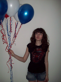
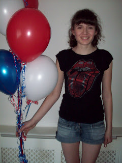
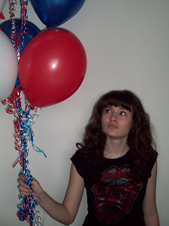
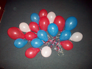
When I had finished planning I then began constructing my magazine. I did this by getting a set of nine helium balloons, three red, three white and three blue. I then had a number of photographs of myself holding the balloons in different places and different ways. I then put all of the pictures onto my blog. Once I had decided on the photograph for the front cover I edited it in Photoshop. I edited my photograph by adding the conventional masthead, sell line, barcode, date, price, issue number, and cover line. Once I was happy with my front cover I published it onto my blog. When I creating my contents page I used Publisher. For my contents page I took photographs of CDs, someone singing into a microphone, a person wearing a mask singing into a microphone. I also took some pictures of people dressed up in dresses and suits. When I had taken my photographs on my digital camera I then placed them onto my contents page adding headings under then with page references. Along the right hand side of my contents page is a list of pages under the headings news, features, reviews and v icons. My contents page covered the conventions of a typical contents page of a heading, article names, page references and photographs. Once I was happy with I published it onto my blog. I then created my double page spread. For this I used Publisher. I changed the page size from A4 to A3. Once I had done that I chose a photograph of the artist. This photograph is a close up of my face with three balloons, one red, one white and one blue framing my face. I then made it so that the photograph was taking up half of the sheet. The other half of the A3 sheet is taken up by a heading and the article each taking up half a sheet of A4. The heading is big and bold and saying “Daisy Dee” with the D of Daisy bigger then the rest of her name and red while the rest is black. Underneath the heading is the phrase “the star of today the star of tomorrow”. The article is made up of questions and answers with a quote pulled out and made bigger and in red. Once I was happy with this I published it onto my blog.
The target audience of my magazine is females aged 16 years olds to early 20s. This can be seen through the images, fonts, colours I have used.
The front cover of my magazine is a typical cover for a music magazine because it covers the majority of the conventions. The conventions that it covers are: masthead, sell line, cover line, main image, barcode, date and issue number. The main image has the artist hold a bunch of helium balloons and looking towards them. The balloons are the colours red, white and blue. The image tells the reader that this is a music magazine because the artist is wearing a rolling stones top. The masthead is at the top of the page because it is the first thing that the reader will see and therefore recognise my magazine by it. The font is sans serif, which means that the edges are straight and not jagged; the text is the largest on my front cover to stand out and get the readers attention, each letter is a capital letter making it stand out even more, the text is black with a white rim around it so that it can be read against the background of balloons. Underneath the masthead is the sell line which says, “The latest music – breaks out” this is slightly to the right and can be read on from the masthead this is also in black. The cover line is in black and red. The artist name is bold and red so that it stands out against the black top that she is wearing. The phrase before the artist name is a lot smaller then the artists name and is black.
The contents page also follows the conventions that I found out for a contents page. The contentions that are covered are images, masthead, page references, headings and article names. The text is all black and is on a red gradient background. The red is darker on the left hand side of the contents page and gets lighter to the wards the right. The masthead is in the top left hand corner. To the right of the masthead is headings saying “this week” under this heading are different headings each with article names underneath. Underneath the masthead are several images; each image has a caption under it and a page number.
My double page spread is a typical double page spread. It follows the convents of a double page spread. These conventions are: masthead, image, page number and article. The heading of my double page spread is “Daisy Dee, the star of today, the star of tomorrow.” The D of Daisy is bigger then rest of the text and it is bold and in red. The rest of the artists name is slightly smaller and is not in bold and is black. “The star of today, the star of tomorrow” is in a different font style to “Daisy Dee” and smaller. The font looks like it has been handwritten this is also in black. The image is of the artist takes up half the page. The artist is seen looking straight into the camera. There are red, blue and white balloons around her face, which creates a look of a border, almost like the artist has been framed up. The article takes up one quarter of the double page spread and is set up with questions and answers. The questions are in red font and answers in black. There is a pull quote near to the bottom left hand side of the image. The pull quote says “I would love to be queen for the day” this text is larger then the article text, it is in bold and red so it stands out.
In conclusion I think that my magzine as a final product looks good. I think that my contents page does not fit in with the rest of my magazine. I have learnt the different conventions of a magazines front cover, contents page and double page spread, I have also learnt how to use Photoshop.
When I had finished planning I then began constructing my magazine. I did this by getting a set of nine helium balloons, three red, three white and three blue. I then had a number of photographs of myself holding the balloons in different places and different ways. I then put all of the pictures onto my blog. Once I had decided on the photograph for the front cover I edited it in Photoshop. I edited my photograph by adding the conventional masthead, sell line, barcode, date, price, issue number, and cover line. Once I was happy with my front cover I published it onto my blog. When I creating my contents page I used Publisher. For my contents page I took photographs of CDs, someone singing into a microphone, a person wearing a mask singing into a microphone. I also took some pictures of people dressed up in dresses and suits. When I had taken my photographs on my digital camera I then placed them onto my contents page adding headings under then with page references. Along the right hand side of my contents page is a list of pages under the headings news, features, reviews and v icons. My contents page covered the conventions of a typical contents page of a heading, article names, page references and photographs. Once I was happy with I published it onto my blog. I then created my double page spread. For this I used Publisher. I changed the page size from A4 to A3. Once I had done that I chose a photograph of the artist. This photograph is a close up of my face with three balloons, one red, one white and one blue framing my face. I then made it so that the photograph was taking up half of the sheet. The other half of the A3 sheet is taken up by a heading and the article each taking up half a sheet of A4. The heading is big and bold and saying “Daisy Dee” with the D of Daisy bigger then the rest of her name and red while the rest is black. Underneath the heading is the phrase “the star of today the star of tomorrow”. The article is made up of questions and answers with a quote pulled out and made bigger and in red. Once I was happy with this I published it onto my blog.
The target audience of my magazine is females aged 16 years olds to early 20s. This can be seen through the images, fonts, colours I have used.
The front cover of my magazine is a typical cover for a music magazine because it covers the majority of the conventions. The conventions that it covers are: masthead, sell line, cover line, main image, barcode, date and issue number. The main image has the artist hold a bunch of helium balloons and looking towards them. The balloons are the colours red, white and blue. The image tells the reader that this is a music magazine because the artist is wearing a rolling stones top. The masthead is at the top of the page because it is the first thing that the reader will see and therefore recognise my magazine by it. The font is sans serif, which means that the edges are straight and not jagged; the text is the largest on my front cover to stand out and get the readers attention, each letter is a capital letter making it stand out even more, the text is black with a white rim around it so that it can be read against the background of balloons. Underneath the masthead is the sell line which says, “The latest music – breaks out” this is slightly to the right and can be read on from the masthead this is also in black. The cover line is in black and red. The artist name is bold and red so that it stands out against the black top that she is wearing. The phrase before the artist name is a lot smaller then the artists name and is black.
The contents page also follows the conventions that I found out for a contents page. The contentions that are covered are images, masthead, page references, headings and article names. The text is all black and is on a red gradient background. The red is darker on the left hand side of the contents page and gets lighter to the wards the right. The masthead is in the top left hand corner. To the right of the masthead is headings saying “this week” under this heading are different headings each with article names underneath. Underneath the masthead are several images; each image has a caption under it and a page number.
My double page spread is a typical double page spread. It follows the convents of a double page spread. These conventions are: masthead, image, page number and article. The heading of my double page spread is “Daisy Dee, the star of today, the star of tomorrow.” The D of Daisy is bigger then rest of the text and it is bold and in red. The rest of the artists name is slightly smaller and is not in bold and is black. “The star of today, the star of tomorrow” is in a different font style to “Daisy Dee” and smaller. The font looks like it has been handwritten this is also in black. The image is of the artist takes up half the page. The artist is seen looking straight into the camera. There are red, blue and white balloons around her face, which creates a look of a border, almost like the artist has been framed up. The article takes up one quarter of the double page spread and is set up with questions and answers. The questions are in red font and answers in black. There is a pull quote near to the bottom left hand side of the image. The pull quote says “I would love to be queen for the day” this text is larger then the article text, it is in bold and red so it stands out.
From audience feedback 50% said that they would buy my magazine just by looking at the front cover. 75% said that they thought the genre of music my magaizne covered was a variety. 35% said that the price of my magazine was resonable but would like to be cheaper. 50% said that my magaizne would repeal to them.
In conclusion I think that my magzine as a final product looks good. I think that my contents page does not fit in with the rest of my magazine. I have learnt the different conventions of a magazines front cover, contents page and double page spread, I have also learnt how to use Photoshop.


