Saturday 30 January 2010

Textual analysis ---> Music Magazine Contents page

This is a content page taken from a NME magazine.
It is a typical contents page for a music magazine as it has a collection of images of bands and solo artist.
Unlike Kerrang Magazine this contents page does not have the heading contents instead it has the heading NME THIS WEEK. It suggests that NME have to remind the reader what magazine they are reading as NME are printed in a large font. Kerrang does not have to have its name on the contents page as big as NME does because it is a well established magazine.

This contents page is a conventional contents page. This is becuase contents pages usually  have a section with the headings "regulars" and  another heading "features" , this contents page is like this unlike the Kerrang contents page I looked at before. Although they dont have the headings "regulars" and "features" they have headings that are simular such as "reviews", "band index", "news" and "studio news".

The colour scheme of this contents page is green. This is unusual for a indie magazine as the colour scheme is usually dark colours like Kerrang's contents page. Thye contents page also uses the colours black and white for the headings. The headings have got white text onto a black background. The font throughout the contents page is the same althought there are differences through text size. The more important the heading the larger the font is.

Along the left hand side there is a heading "Band Index". This heading unlike the other headings is black font on a white background. There is then a list of different bands that are in this issue of NME magazine. The list of band names are in the colour red, this makes them stand out to the reader as the rest of the text is in black.  

Just like the Kerrang magazine there is a subscription box in the bottom lefthand side. It has white and yellow font on a black background with an image of the magazine. The font that is in yellow I think is more importantthis is because it stand out more then the white font.

The format of this font is formal yet rebellion. This is because it is set out like a typical magazine but the font is at an angle giving it a edgey look. NME may of done this to show genre of the music the cover.
Saturday 23 January 2010

Magazine Front Cover –> draft one

5
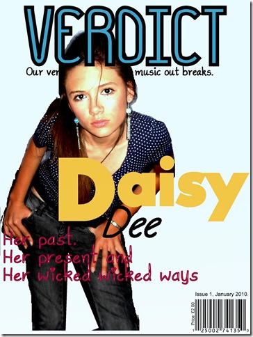
This is my first daft of my music magazine “VERDICT”. I think for a first draft that it is a good attempt. It has the majority of the conventions of a music magazine front cover, such as a barcode, price, date and issue, masthead, sell line, main image and a cover line. The only conventions that are not on this front cover are sub-headings and sub-images. I like the brightness of the images as I think it makes the face stand out more. I like how there is a slight colour in the background as a pain white background would make me magazine look bland. For my next front cover I would improve on it my adding some sub-headings and images, make the cover line stand out more as it is a little difficult to read on the dark background of the artists leg.

Thursday 21 January 2010

Textual analysis ---> Music Magazine Contents page


This is a contents from Kerrang Magazine It is a typical contents page for a music magazine because it shows images of bands and solo artists.
 In the top right hand corner is the "contents" heading. This shows the reader what page they are on. Under the "contents" heading  there is a quote from an article in the magazine. I think that this quote would be from the main article which would be seen on the front cover.
Along the right hand side there is a heading reading "this week".The headings use a similar style but are an other way round. The text of the heading "this week" is in black with a yellow background while the headings below are  in a yellow font with a black background. Under these are a list of articles with the number on the left of them.
In some ways this contents page is not a conventional contents page. This is because contents pages usually have a section with the heading "regulars" and another heading "features", this contents pages is not like that. It has a list of pages and images with page references along the side.
Most of the photographs have a main heading which is in bold making it stand out. They also have a caption underneath to let the reader what the image is about and a page number which lets the reader now what page they need to be on for that particular article. Although these images are not listed in the long list of pages on the right hand side.
The contents heading is larger then then the this week heading this is because this needs to stand out more. It follows the theme of the yellow and black for the text. The page reference for the images also follow this theme, with yellow text and black background.
In the top left hand corner there is a editors note about this issue of the magazine and the band featured. The same style of font is used through out the contents page, although the contents heading has lower case and upper case while the other headings are all in upper case.
In the bottom right hand corner there is a subscription advert for the magazine. This is red with white font which stands out compared to the rest of the text which is all yellow and black. I think that is done because Kerrang want people to subscribe to their magazine rather then someone else's magazine.