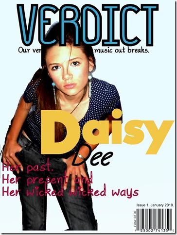
This is my first daft of my music magazine “VERDICT”. I think for a first draft that it is a good attempt. It has the majority of the conventions of a music magazine front cover, such as a barcode, price, date and issue, masthead, sell line, main image and a cover line. The only conventions that are not on this front cover are sub-headings and sub-images. I like the brightness of the images as I think it makes the face stand out more. I like how there is a slight colour in the background as a pain white background would make me magazine look bland. For my next front cover I would improve on it my adding some sub-headings and images, make the cover line stand out more as it is a little difficult to read on the dark background of the artists leg.
No comments:
Post a Comment